Editing Elements
Table of Contents

Editing Text
- Double click any text box or button to start editing its contents.
- Double click an input field to edit the placeholder text.
- You can use Control + B to bold text and Control + I to italicize once highlighted in the builder.
Changing Font Color
- First select the text box, button or input field you'd like to change the font color for.
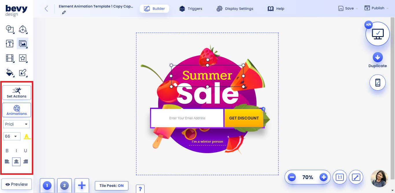
- Click the A with an underline that appears on the left toolbar.
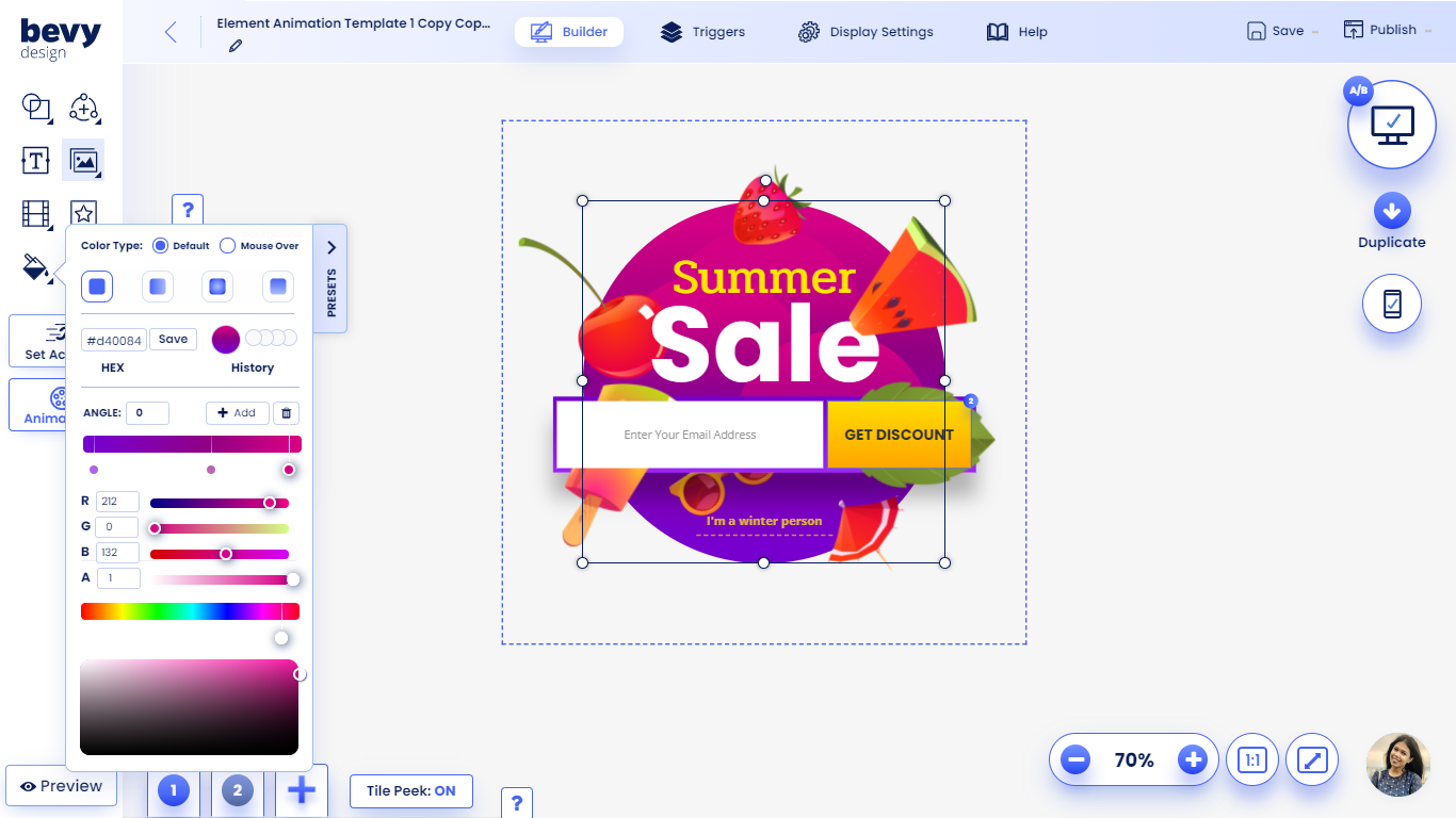
- Select a solid color from the color grid, enter a hexadecimal or use the color slider to make a selection.
- Exit the color picker by clicking outside of it.
Changing Font Size
First select the text box, button or input fields you'd like to change the size for.
Click the font size dropdown to choose a new font size or type your desired size
NOTE: For mobile input fields, set a minimum size of 16 pixels to avoid erratic behavior.
Other Font Options
- You can align text in the left, center or right of the selected element.
- Use the Bold, Underline and Italic controls to further modify the text.

Editing Background Color
To edit the background color of any element, click the Paint Bucket and select a color to start editing.
NOTE: The foreground color of icons will change color when the paint bucket is used.
Using the Color Grid
- One of the options you have is to select a color from the grid to set a new background.
- The first tile is full transparency
- The other tiles in the first two rows are gradient colors.
Setting Custom Color (Hexadecimal)
- Enter a hex color code in the designated space.
- Click enter to confirm the color.
- Here is a guide on hexadecimal coloring.
Adjusting Opacity (Transparency)
- The first tile in the color pallet is transparency.
- Adjust the 'A' slider to modify the opacity of any color.
Saving brand colors to your account
- First select a color or gradient you'd like to save.
- Click the plus button in the color menu to save it to your account.
Advanced Gradient Guide
- To start building a gradient, click the Solid Color dropdown to select a gradient type.
- Click the Add button to add another color to the gradient.
- You can click on the color squares to modify each of the seperate properties.
- Select a color from the grid or use the sliders to modify each part of the gradient.
- You can drag the squares to the left and right in order to modify the gradient pattern.
- Click the x button once a gradient square is selected to remove it.
Setting an On-Hover Color
- Click the default color dropdown to select an on-hover color.
- While having the on-hover color selected in the dropdown, you will preview the new color.

Editing Borders or Outlines
- Click on any element to set a border or outline.
- Then select the Borders menu to initiate the outline creation process.
Setting Border Style
- There are several types of borders you can create with Bevy Design. Click the dropdown in the borders menu to change the style. Some styles can be seen below:
- Solid Line
- Dashed Line
- Dotted Line
- Double Line
Choosing Border Color
- Click on the color tile in the borders menu.
- Select a non-gradient color to set it as your border color.
Setting Border Width
- Enter the size of pixels into the input boxes to change the border size.
- Enter a pixel value in the left-most input field to set a border on every side.
- If you'd like to set specific sizes you can use the other 4 input fields. They represent the following | Top Border | Left Border | Bottom Border | Right Border |
Rounding the Border
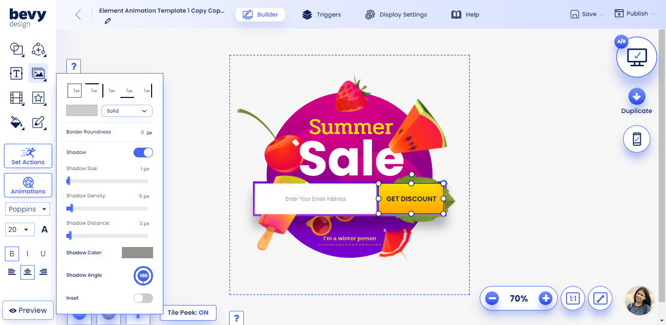
- In the Border Roundness input field enter a value from 1-88 px.
- Higher values result in rounder edges.

Adding Shadows
- You can add a shadow to any element on Bevy Design using the Shadows option in the borders menu.
- Start off by toggling the Shadow button.
Changing Shadow Color
- Click the color tile to select a shadow color.
- You can only use solid colors as shadows.
Advanced Shadow Techniques
Using these techniques will help you add depth to each individual element.
Shadow Size
- Increase this slider to create a larger shadow around the element you've chosen.
Shadow Density
- Increasing the pixel value for density makes the shadow less dense/dark.
Shadow Distance
- Increasing shadow distance moves the shadow in the direction of the angle you've set.
Shadow Color
- Click the color tile select a shadow color.
- Note: you can only select a solid color as a gradient.
Shadow Angle
- Click and drag the angle dial to change the angle of the shadow's distance.
- You can also modify the angle by editing the angle text.
